Common Earth: Reimagining What's Possible
Helping an organization connect and educate people about climate change.
Overview
Common Earth is a global community dedicated to helping people gain a better understanding about climate change, acquire new perspectives and take steps to address the issue. They provide resources such as courses, workshops and trainings to support meaningful change in how people approach climate action.
Fractal was engaged to craft a new brand identity and website to better reflect Common Earth's values, philosophy and mission.
Project Scope
Services
Brand Identity & Guidelines
Web Design & Development
Timeline
2024
The Challenge
Common Earth presents a unique approach to climate change education and action. For Common Earth, there are no obvious answers or easy solutions. Instead, through their education programs, they provide a holistic understanding of the various forces involved and help participants shift their thinking from hopelessness to possibility and agency, and are continuing to build a community of people with this perspective.
This complex, nuanced approach, supported by a wide variety of information and course offerings, poses a challenge for branding and website information architecture requiring thoughtful planning and design.

The Solution
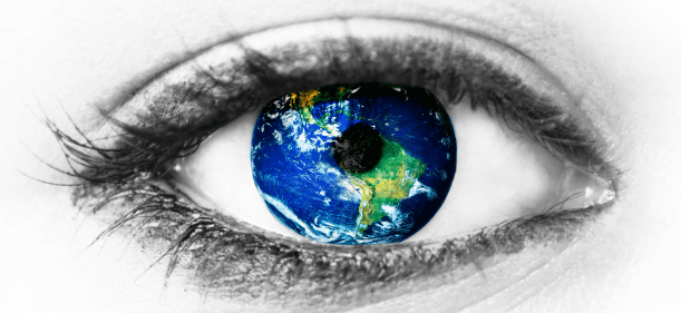
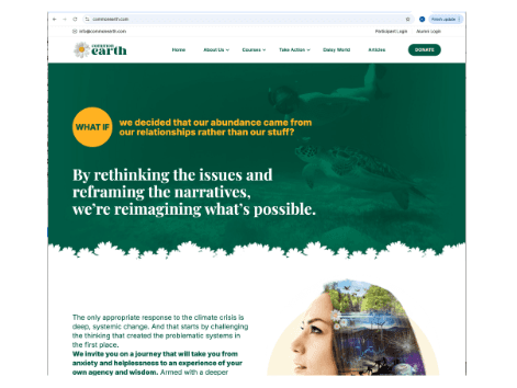
At the heart of Common Earth's philosophy sits a simple but powerful message: everything is connected. The climate crisis is not a single problem with a single solution, but a living system of relationships between land, people, economies, and culture. What happens in one place ripples outward, shaping lives elsewhere.
Fractal's approach to brand identity development centered around that idea of connection. This core theme was the guiding principle that flowed through logo design to website development. We connected the various aspects of Common Earth's activities through clear web copy and engaging graphical representations that allowed users to easily understand what the organization was about, and be invited to go deeper and learn more.
What We Did
Logo Design
The Common Earth logo centers on a single daisy, a symbol chosen not just for aesthetic beauty, but for meaning. Climate action is not simply about reduction or restraint; it is about renewal. It is about rethinking systems, restoring balance, and opening the possibility of a different future. The daisy embodies that shift: quiet, hopeful, and resilient.
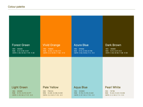
Typography and Colour Palette
Thoughtful type choices bring clarity and warmth to complex ideas, while colours echo natural cycles, such as deep greens for growth and stewardship, earthy neutrals for grounding, and subtle highlights that draw the eye without demanding it. Together they create a sense of gentle attentiveness that mirrors how Common Earth wants people to engage with climate issues: consciously, intentionally, and with care.
Visual Identity and Guidelines
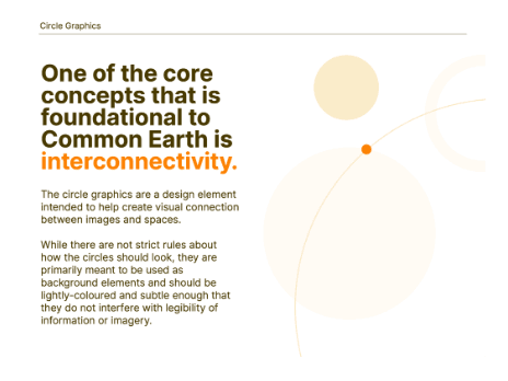
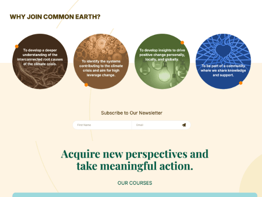
The concept of interconnectivity is visually depicted in the branding through the use of a variety of circle graphics that touch and connect with one another.
Web Design & Development
The Common Earth website is designed to be a living expression of interconnected thinking. Just as Common Earth seeks to shift how people understand the climate crisis, the website’s design reimagines how information, experience, and inspiration can co-exist online.
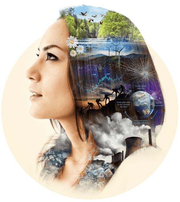
Imagery and Iconography
Imagery and iconography are rooted in the same symbolic language as the brand: organic shapes, familiar motifs like the daisy, and visual cues that emphasize growth, connection, and regeneration. These elements map relationships, linking stories, projects, and community efforts in ways that reinforce the idea that climate understanding is not linear, but networked.
Have a difficult communications problem? Reach out, we’re always happy to chat.

